

Window Display Copywriting NZ: Stop Shoppers in Their Tracks
Passers-by decide in a few seconds whether a shopfront deserves a second look. Most window copy wastes that time on a company name, a vague slogan or a paragraph nobody will read at walking pace. If you run a real estate office, café, restaurant or shop in Auckland, Wellington or Christchurch, your window is often the cheapest advertising you own. This guide covers practical window display copywriting NZ businesses can use, whether the message sits on a printed card, a backlit paper display or a digital screen.
Table of Contents
- Quick Takeaways
- Why Pedestrians Decide in Seconds
- Lead With One Clear Message
- Write for the Glance, Not the Read
- Digital Window Copy: Timing and Length
- Calls to Action That Earn a Second Look
- Comparison: Three Copy Approaches Compared
- Matching Copy to Your Audience
- Common Mistakes in Window Copy
- Frequently Asked Questions
- References
Quick Takeaways
| Key Insight | Explanation |
|---|---|
| Lead with one promise | A passer-by reads one line at walking pace, so the window needs a single benefit or offer, not a company profile. |
| Keep headlines to a few words | Aim for five words or fewer on the main line, with large type that reads from the footpath. |
| Brand every window | Put your logo or name on the glass so people who remember the display can find you later. |
| End with one action | Give one clear next step, such as scanning a code, booking a table or visiting an open home. |
| Respect screen timing | Digital slides should hold for roughly 7 to 15 seconds, so each slide carries one idea. |
| Test from the kerb | Read the copy from the spot where a pedestrian stands, in real light and at real distance, before you print or publish. |
Why Pedestrians Decide in Seconds
The Boutique Hub, a retail blog, puts it simply: when someone walks past a storefront, it only takes seconds for them to decide whether to step inside. That decision is made on the footpath, long before anyone reads a brochure or checks a website. Your copy has to do its job inside that short window of attention.
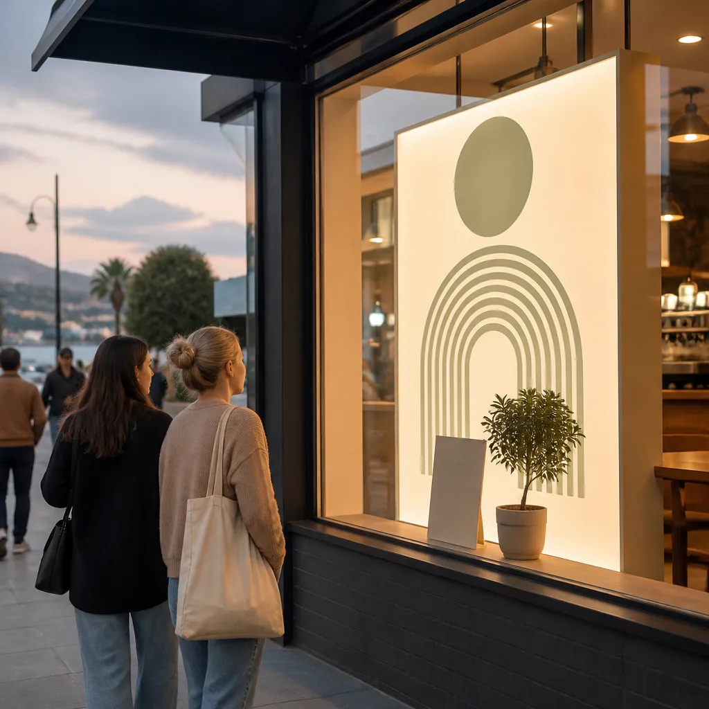
In practice, the copy is judged by someone who is moving, distracted and not yet interested. They have not come to read. They are scanning for a reason to slow down, and if nothing in the window gives them one, they keep walking.
The Walking-Pace Test
Before you write a word, walk past your own shopfront at a normal pace and try to read it. The copy you thought was punchy often turns out to be a block of text nobody reads at speed. If you cannot take in the main message in one pass, the message is too long.
Pro tip: Do the walk-past test with your phone. Take a photo from the position of a pedestrian at the kerb, then zoom in on the headline. If you cannot read it in that photo, neither can someone walking by.
What the Glance Actually Captures
A glance picks up shape, colour, contrast and a single line of text. It rarely picks up a paragraph, a list of services or a price table. Copy that depends on detail to make sense is wasted on the footpath, so save the detail for the door or the online listing.
Light matters too. A window that looks sharp at night can wash out under midday sun, and a shopfront facing west may have glare in the late afternoon. Choose display surfaces and text colours that stay legible in those conditions, not just in the showroom.
Lead With One Clear Message
Every window needs one main idea. A display that promises fresh coffee, free parking, a loyalty card and a seasonal menu gives the passer-by four reasons to ignore it. Choose the one thing that matters most to the person you want to walk in, and make that the headline.
A window that tries to say three things ends up saying nothing to someone walking at pace.
Pick One Promise
A promise is a benefit, not a feature. Double-glazed, UV-protected screens are a feature the owner cares about, while a line like Your home, seen by everyone walking this street tells a property seller what they gain. Write the promise first, then decide whether any feature deserves a place in smaller type.
Say What the Passer-By Gets
Good window copy answers the question the reader is already asking: what is in it for me? A café can say Fresh bread from 6 am, and a real estate office can say Just listed on this street and point to a screen or printed sheet. Each line should give a reason to pause, not a reason to read more.
Write for the Glance, Not the Read
Headlines should be short enough to read in one breath. Five words or fewer is a good target for the main line, and anything longer should move to a secondary line in smaller type. Large, plain fonts beat decorative scripts, which look elegant at arm’s length and become illegible from the kerb.
Cut Words Until They Hurt
Most window copy is longer than it needs to be. Go through your draft and delete every adjective that does not change what the reader does next. Stunning, premium and handcrafted add nothing, while Handmade on its own may be enough to carry the line.
Ask a colleague who has not seen the draft to read it from three metres away for five seconds. Whatever they remember is your real headline, so rewrite until that matches what you intended.
Use Space and Type as Part of the Message
Spacing does work that punctuation cannot. Leave clear space around the headline so the eye lands on it first. Keep text colours to one or two, and make sure the contrast with the background is strong enough to read in daylight.
Digital signage guidance makes the same point: avoid small text and long paragraphs, and use brand colours consistently so the screen feels like yours.
Pro tip: Write the headline, then cover the rest of the window with your hand. If the headline makes sense on its own, everything else is supporting material, not the main event.
Digital Window Copy: Timing and Length
Digital screens change the copy problem because a message can disappear before it is read. One digital signage content design guide recommends keeping each item on screen for roughly 7 to 15 seconds, and it warns against small text and long paragraphs. Those are good numbers to design around, even if your screen rotates on a different schedule.
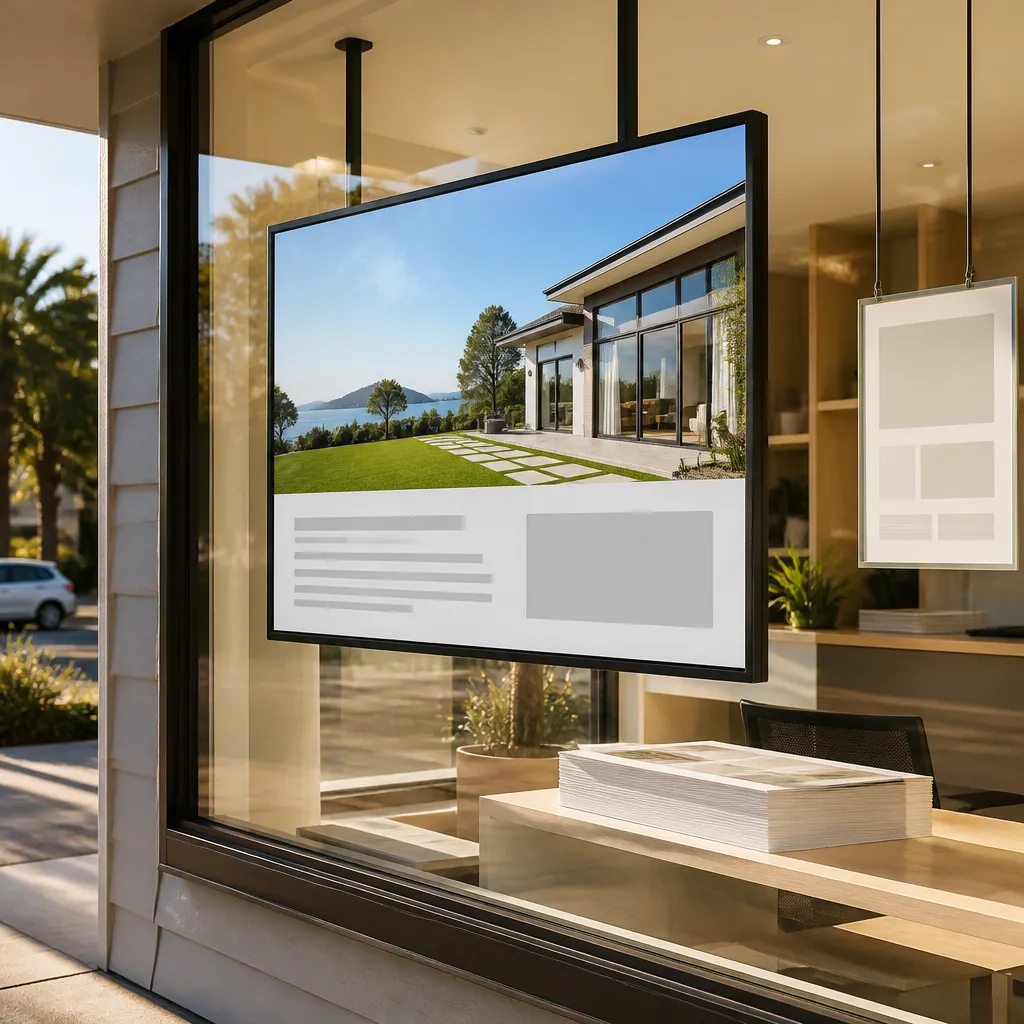
One Idea Per Slide
Each slide in a rotation should carry one idea, one image and one line of support. A loop with a listing, a price, a booking prompt and a brand line works better than one slide trying to hold all four. If you need more than four or five slides, your message probably has too many parts for one screen.
Changing Copy Without Changing the Hardware
Remote content management is where digital windows earn their keep. When copy can be updated over WiFi from an office, a real estate team can swap a listing headline the day a property goes under offer, and a café can change its breakfast message before the morning rush. Stale copy on a screen is worse than no screen, so build the update into your weekly routine.
Test From the Footpath
Check the screen from where a pedestrian would stand, and at the time of day when the window is busiest. Glare, reflections and the angle of the glass all change what people can read. A slide that looks sharp indoors can disappear in direct sun, which is why sunlight-readable screens matter for street-facing windows.
Calls to Action That Earn a Second Look
Window copy that stops someone should also tell them what to do next. The Boutique Hub’s guidance on window displays makes the point that passers-by need a way to remember you or find you later, and that is the job of a call to action. Without one, a good window creates a moment of interest that fades as soon as the person turns the corner.
Give One Action
Pick one action and make it obvious. Scan to see the full listing, Book your table with the code below or Follow us for weekend specials are all clear. Offering three choices at once tends to get none of them.
Make the Action Easy to Carry Away
A small printed handle sticker, a QR code or a phone number on a card gives someone a reason to act later. Many people will not act at the window itself, so the action has to survive after they have walked on. Print the brand name next to the action so the two stay linked in memory.
Pro tip: Match the action to the time of day. A café window at 7 am can ask for a morning order, while a real estate window on a Sunday afternoon can invite people to an open home. An action that needs the shop to be open is wasted when the shutter is down.
Comparison: Three Copy Approaches Compared
Not every window needs the same type of copy. The right format depends on how often the message changes, how much light the window gets and how many people pass at each time of day. The table below compares three common approaches on those points.
| Approach | Best Use | Main Weakness |
|---|---|---|
| Static printed copy | Long-running offers and brand messages that rarely change | Cannot respond quickly, and strong sun can fade it over time |
| Backlit printed paper | Real estate listings and premium promotions that need to glow after dark | Needs a fresh print run for each change to the layout |
| Digital rotating screen | Frequent updates, several messages and remote changes from the office | Each slide gets only seconds, so the copy must be tight |
Where Static Copy Still Wins
Static copy has an advantage digital screens cannot match: it is always on, and it does not depend on a power supply or software working correctly. For a café with a stable menu, a well-written printed sign can do more work than a rotating screen that cycles through too much.
Where Digital Copy Pulls Ahead
Digital copy wins when the message needs to change weekly or within the day. A real estate team with several listings, or a retailer running timed promotions, gets more from a screen that updates remotely than from reprinting each time. The trade-off is discipline, because every slide has to earn its seconds.
Matching Copy to Your Audience
The Boutique Hub makes a sharp point about target markets: if the audience cannot relate to the display, they will assume the products are not for them. That applies to every window, whether you sell coffee, homes or clothing. Copy should speak to the specific person you want to step inside.
Real Estate Windows
Passers-by on a residential street are often neighbours, buyers or sellers already thinking about property. Copy works better when it names the street, suburb or type of home than when it talks about the agency itself. Avoid claims about sale results or prices unless you can back them up with accurate, current information.
Cafés and Restaurants
Café copy should follow the rhythm of the day. A morning line about fresh bakes suits the footpath at 7 am, while an evening line about dinner bookings suits a restaurant after 5 pm. Use the same typeface and colours across the shop so people recognise you before they read a word.
Retail Stores
Retail windows need to answer the question of who the store is for. A homewares shop might show one styled room with a seasonal headline, while a fashion boutique may show one outfit with a clear price point. The consistency advice from the Boutique Hub applies here too, since the window should match the story your store tells inside.
Common Mistakes in Window Copy
Most weak window copy comes from a few repeated errors. Owners fill the glass because empty space feels like wasted money, and they write for the people already inside the shop. Fixing those habits often improves a window faster than redesigning it.
Logo-Only Windows
A logo alone rarely stops anyone unless the brand is already well known locally. Pair the logo with a promise or a question, so the window gives a reason to look and a name to remember.
Lighting That Fights the Copy
A storefront lighting guide from WEDC recommends placing lights close to the glass, spaced 18 to 24 inches apart, and aiming them back into the display rather than into the eyes of pedestrians. A backlit sign that glares into the footpath hides the very headline it is meant to show. Test your backlighting after dark from the kerb, not from inside the shop.
Pro tip: Turn on the window lights and walk the street at night. If the glow hides the headline, move the light or lower its intensity before you change the copy.
Frequently Asked Questions
How many words should a window display have?
Aim for a main headline of about five words or fewer, with no more than one or two short supporting lines. Anything longer belongs inside the shop or on a website where people can read at their own pace.
How often should digital window copy change?
Change the copy whenever the offer, listing or opening hours change, and at least weekly for most businesses. Stale messages on a screen suggest a neglected business, so build the update into a routine rather than waiting for a problem.
What font size works for shopfront copy?
There is no single correct size, but the headline should be readable from the footpath at normal walking distance. Print a draft at actual size, tape it to the glass, then step back to the kerb to check it.
Should I put a QR code in my window?
Yes, if the code leads somewhere useful and mobile-friendly, such as a listing page, booking form or menu. Make the code large enough to scan from a short distance, and pair it with a short line that explains what the scan gives the reader.
Can I use a second language in my window copy?
Bilingual copy can work when your customers speak both languages, but keep the main message in the language most passers-by read fastest. A second line in smaller type avoids crowding the headline.
How do I know if my window copy is working?
Watch for signs such as enquiries that mention the window, customers asking about a specific offer, or extra visits on the day you change the copy. Change one element at a time so you can see what made the difference.
We would love to hear which window line has worked best for your business, so share your experience with us.